


Octopi Launcher • Home Screens
OctopiAppFactory
I approached Octopi Launcher as a replacement for the standard Android home screen, not as another wallpaper or icon-pack utility. Its central idea is simple: it wants the launcher itself to feel less predictable. That makes it interesting for people who are tired of the usual grid of icons, but it also means the first few minutes require more attention than a conventional launcher. In my experience, the value appears when I stop treating the home screen as a decorative page and start using it as a repeatable way to reach the apps I use every day.
This is a free personalization app from OctopiAppFactory, available for users running Android 8.0 or later. It is aimed at everyone rather than a specialist audience, and the current version is 1.865. The app has built a 4.7 average from around 1.7 thousand ratings, with more than 100 thousand installs, which suggests that its unusual approach has found a real audience. Optional in-app purchases range from $0.99 to $2.99 per item, so the basic decision is easy: install it first, learn the workflow, and only then decide whether any extras are worthwhile.
Making the home screen useful instead of merely familiar
My baseline workflow after installation
The first thing I recommend is resisting the urge to recreate the phone’s old layout immediately. If you copy every icon into the same positions, you may judge Octopi Launcher only by how closely it imitates the launcher you already have. I found it more useful to begin with the handful of apps I open without thinking: messages, phone, camera, maps, browser, notes, and any one app connected to work or study. The goal is to see whether Octopi’s different arrangement helps those actions feel quicker or more deliberate.
A practical first session is to use the home screen normally for a day without constantly changing it. Notice which apps you reach for repeatedly and which ones you only open because they happen to be visible. That distinction matters. A crowded screen can make rarely used apps look important, while a deliberately arranged screen can turn the phone into a small set of familiar entry points. Octopi Launcher is at its best when the layout reflects actual habits rather than an imagined perfect organization.
I also suggest keeping the first setup modest. Put essential communication tools where your thumb naturally lands, leave occasional apps out of the main path, and avoid spending twenty minutes adjusting details before you know whether the overall interaction suits you. A launcher is something you touch dozens of times a day. Small movements and repeated choices matter more than an attractive setup that feels clever only during the first evening.
Related News

Why WhatsApp Messenger Still Makes Everyday Communication Feel Easy

Jurassic World: The Game Is the Better Dino Tycoon for Strategic Players

Threads in Real Life: Who Should Join, Lurk, or Leave

How SHEIN Turned Shopping Into an Endless Content Feed

How to Make Fortnite Feel Smarter on Mobile

Should You Switch to Microsoft Outlook on Mobile?
For a realistic example, imagine leaving home while expecting a delivery. I might open messages to answer the courier, maps to check the route, and the phone app to call if the address changes. With a traditional launcher, I usually scan a familiar grid. With Octopi, I pay more attention to the relationship between the shortcuts I chose and the actions I repeat. If the layout keeps those three tasks easy to find, it earns its place. If I have to pause and search for them, the novelty is costing more than it saves.
What makes it different from a conventional launcher
Most default launchers are designed around immediate recognition: rows, folders, a dock, and a predictable app drawer. That model is dependable, and it remains the better choice for anyone who shares a phone, changes devices often, or wants zero adjustment time. Octopi Launcher takes a more personal route. Its appeal is not that every user will find it faster, but that each user can build a home screen around the way they actually move through the phone.
That difference creates an important trade-off. A standard launcher gives me transferable muscle memory. Octopi gives me more reason to think about the structure of my shortcuts. If I use several Android phones and want each one to behave almost identically, the usual system launcher may be less frustrating. If I use one phone heavily and feel that the standard grid has become visual clutter, Octopi has a stronger case.
Gallery
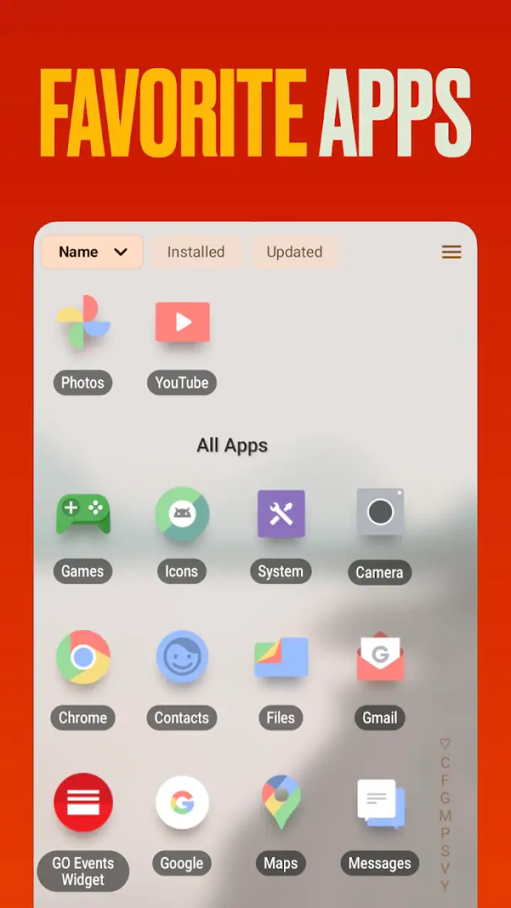
I would not describe it as a productivity suite. It does not replace a task manager, notification system, or full automation tool. Its contribution is narrower and more immediate: it changes the starting point for opening apps. That sounds small, but the home screen is repeated constantly, so a good arrangement can influence the entire rhythm of using a phone.
Settings worth checking before settling on a layout
After the first day, I would go through the launcher’s settings rather than accepting the initial arrangement as final. The important question is not how many options appear, but which choices affect the way the screen behaves during ordinary use. Check how shortcuts are placed, how much visual information is shown, and whether the arrangement encourages quick access or makes you stop to interpret it.
One useful habit is to change only one setting at a time. If I alter the layout, appearance, and shortcut behavior together, I cannot tell which change improved the experience. Testing in small steps is especially valuable with an unconventional launcher because a setting that looks more elegant may be slower when I am distracted, walking, or using the phone one-handed.
Another worthwhile check is whether the home screen still feels readable in different situations. A design that works in bright indoor light may be less comfortable outdoors, and a compact arrangement may become awkward when I am trying to tap quickly. I would also test it after receiving several notifications, because a launcher should remain understandable when the phone is busy rather than only when the screen is clean.
There is a broader lesson here: personalization is not the same as customization for its own sake. I get the most from Octopi when each adjustment answers a practical question. Can I reach the camera without searching? Can I identify the messaging shortcut at a glance? Can I return to a frequently used app without opening a second layer? If the answer is no, a visually interesting setting is probably not helping me.
Building repeatable patterns instead of relying on memory
Experienced users will probably get more from the app by creating patterns they can repeat. I like to group actions by situation rather than by the category printed on the app icon. For example, a morning group might include calendar, weather, email, and transit tools, while an evening group might favor reading, music, and messaging. This approach is more useful than placing every similar app together if the groups match the moments when I actually use them.
A second pattern is to keep the most urgent actions visually distinct from the merely frequent ones. I may open a browser many times, but a phone shortcut can be more important when I need it immediately. Giving both the same visual weight creates hesitation. Octopi’s different approach encourages me to decide which actions deserve the shortest path, and that decision can make the screen calmer even when the phone contains many apps.
A third pattern is periodic pruning. Once a week, I would remove shortcuts I have not used and replace them only if a real habit has changed. This is not busywork. Home screens slowly accumulate leftovers from temporary projects, travel, shopping, or one-off downloads. A launcher built around personal organization loses its advantage when the layout becomes a museum of old intentions.
For people who regularly lend their phone to family members, this personal approach has a downside. Another person may not understand where familiar apps have gone, and explaining the layout can be slower than using a standard grid. I would keep the default launcher available as a fallback and think carefully before making Octopi the only interface on a shared device.
Shortcuts, repetition, and the cost of experimentation
The best shortcut is not necessarily the one that looks closest to the thumb. It is the one I can identify without hesitation. During testing, I would open the same few apps from different parts of the screen and notice whether the path becomes automatic after repetition. If an arrangement requires a visual search every time, I would simplify it even if the design looks less distinctive.
This is also where the app can expose a limitation of personalization: a layout may work brilliantly for one hand and poorly for the other. If I switch hands often, use a large phone, or operate the device while carrying something, I need to test those situations rather than judging the setup from a desk. A home screen should serve the body I actually use, not an idealized setup position.
I would be cautious about changing the layout every time I feel bored. Constant experimentation prevents muscle memory from forming. A better method is to keep a stable arrangement for several days, record the moments that feel slow, and then make one targeted adjustment. That turns Octopi from a novelty into a system. The improvement comes from consistency, not from endlessly searching for a perfect design.
Where the unusual approach reaches its limits
Octopi Launcher cannot solve every problem associated with a busy Android phone. It does not make a rarely used app more useful, remove the need for sensible notification control, or replace the organization offered by folders and the app drawer in a conventional launcher. If the main issue is storage, distracting notifications, or too many accounts, changing the starting screen may only address a small part of the problem.
There is also a learning curve. Someone accustomed to the default Android layout may initially feel slower, especially when opening an app from habit. That is not necessarily a defect, but it is a real cost. I would not install this immediately before a trip, a work presentation, or any period when I need guaranteed familiarity. Give yourself time to adapt while the phone is not under pressure.
Compatibility expectations should be realistic as well. The app supports Android 8.0 and newer, which covers a broad range of devices, but the experience can still vary with screen size, manufacturer software, navigation style, and other launcher-related behavior. I would test it on the device that matters to me rather than assuming that a setup shown elsewhere will feel identical on my phone.
Users who want a huge ecosystem of themes, deep automation, or highly granular visual controls may prefer a more established customization-focused launcher. Likewise, people who want the least possible decision-making should stay with the phone’s default option. Octopi is not automatically better than those alternatives; it is better suited to someone who sees the home screen as a personal workflow and is willing to shape it.
Free access and the question of optional purchases
The app is free to install, so there is little risk in trying the core experience. That makes the learning curve easier to accept because I do not have to commit financially before discovering whether the interaction feels natural. The optional purchases, priced from $0.99 to $2.99 per item, are best considered after I have used the launcher long enough to identify a genuine need.
I would avoid buying anything simply because the app feels new or different. First establish a stable layout, then ask whether an optional item solves a problem I actually encounter. If the free setup already gives me a cleaner route to my everyday apps, spending more may not improve the result. On the other hand, a small purchase can make sense for someone who has adopted the launcher and wants to support its continued development, provided the added option is useful to that person.
Because the app is rated for Everyone, it is approachable for a wide range of users, but that does not mean every age group will prefer its design. Children and less technical family members may find a familiar default layout easier, while an adult who enjoys organizing a personal device may appreciate the freedom. The age rating describes accessibility, not a guarantee that the interface will suit every habit.
Who should try it, and who should skip it
I recommend giving Octopi Launcher a fair trial if you repeatedly open the same small set of apps, dislike visual clutter, and enjoy refining the way your phone works. It is particularly appealing when the default home screen feels like a storage shelf rather than a useful starting point. People who use their phone for distinct routines—work, commuting, study, or communication—can benefit from designing shortcuts around those routines.
I would skip it if you need instant familiarity above everything else, frequently hand your phone to other people, or depend on a standard grid across several devices. I would also hesitate if you are hoping for a complete productivity transformation. A launcher can reduce friction at the first tap, but it cannot compensate for disorganized notifications, unclear app choices, or habits that change every hour.
For me, the deciding test is simple: after several days, do I reach the apps I need with less visual searching, or am I merely enjoying the novelty? If the answer is the former, the app has earned a permanent place. If the answer is the latter, returning to the standard launcher is sensible rather than disappointing.
My final assessment after using it as a daily starting point
Octopi Launcher is a thoughtful alternative to the familiar Android home screen. Its strongest quality is that it makes me examine the connection between layout and habit. Instead of assuming that a grid is the natural answer, it invites a more personal arrangement, and that can make a phone feel less cluttered when I put in the effort to maintain it.
Its weakness is closely tied to that strength. The app asks for experimentation, patience, and a willingness to build new muscle memory. Users who want everything to behave exactly like the default launcher may find that effort unnecessary. The experience also depends heavily on making good choices; a badly planned personalized screen can be more confusing than a standard one.
With a 4.7 average and over 100 thousand installs, it is clear that this is not just an abstract design experiment. Still, I would judge it by the workflow it creates on my own phone rather than by its popularity. The free entry point makes that test straightforward, and the Android 8.0 minimum keeps it accessible to many devices.
My recommendation is to install it, begin with a small set of essential shortcuts, and use the same arrangement long enough for habits to form. Do not chase visual novelty, and do not purchase optional items until the basic workflow proves itself. For users willing to turn the home screen into a deliberate daily tool, Octopi Launcher is worth trying; for users who value instant familiarity, the conventional launcher remains the safer choice.
In the end, I see it as a launcher for people who want their phone to reflect how they act, not simply how Android has always arranged apps. That is a narrower audience than the broad age rating suggests, but it is a well-defined one. If you enjoy adjusting settings, testing shortcuts, and keeping a repeatable routine, this unusual home-screen app can become genuinely useful rather than merely different.
FAQs for Octopi Launcher • Home Screens
What is Octopi Launcher • Home Screens, and what does it do?
Octopi Launcher • Home Screens is an Android customization app designed to replace or enhance your device’s standard home screen. It lets you organize applications, create a more personalized layout, and access your favorite tools more conveniently. The launcher focuses on changing the way the home screen looks and behaves, rather than adding entirely new functions to the phone itself. Its usefulness will depend on how much control and visual customization you want.
Is Octopi Launcher compatible with every Android phone?
Octopi Launcher is intended for Android devices, but the exact experience may vary depending on your phone model, Android version, screen size, and manufacturer interface. Some features may work differently on Samsung, Xiaomi, Motorola, Pixel, or other devices because each brand applies its own system settings and restrictions. Before downloading, check the app’s Google Play compatibility information and make sure your device supports the required Android version.
Will Octopi Launcher affect my phone’s performance or battery life?
As with any replacement home-screen application, Octopi Launcher may use some additional memory and background resources. On newer phones, the impact is usually minor, but older or entry-level devices could experience slower transitions, occasional reloads, or slightly increased battery consumption. During testing, it is sensible to monitor performance after installation, especially if you use animated effects, widgets, custom gestures, or other visual features extensively.
Can I return to my original home screen after installing Octopi Launcher?
Yes, installing Octopi Launcher does not permanently remove your phone’s original launcher. Android normally allows you to switch between installed home-screen apps through the default-app settings. If you decide that Octopi Launcher is not suitable, open your device’s Settings, find the Home app or Default apps section, and select the manufacturer’s original launcher. You can also uninstall Octopi Launcher afterward if you no longer need it.
Does Octopi Launcher require special permissions or collect personal data?
A launcher may request permissions related to displaying over other apps, notifications, accessibility features, usage access, or managing shortcuts, depending on the functions it provides. These permissions should be reviewed carefully before enabling them. Octopi Launcher’s privacy practices, data collection, and third-party sharing policies can change with updates, so read the current Google Play listing and privacy policy. Avoid granting access that is not necessary for the features you plan to use.
Pros
- Clean
- minimalist interface keeps your home screen uncluttered.
- Flexible icon and layout customization supports a personal setup.
- Smooth navigation makes switching between apps quick and simple.
- Useful organization tools help reduce time spent searching for apps.
- Lightweight design is suitable for devices with limited storage or RAM.
Cons
- Some advanced customization options may require in-app purchases.
- The minimalist layout may feel too restrictive for power users.
- Compatibility can vary across Android versions and device brands.
- Launcher settings may take time to learn for first-time users.
- Occasional updates may change layouts or affect existing customizations.


